

A Cover Story
Some thoughts on book covers and their importance.


Before I get into today’s post, I want to first take a moment to thank so many of you who pre-ordered my debut novel, VICTIM, in the past two weeks, and to those who have also reached out with such kind words of support. It feels great to have something real to point people toward, and it is so cool to hear that the novel is something many of you are genuinely interested in reading.
So, thank you. Truly.
I’m writing this at a local café of mine. I’m staring at the cover for Yellowface by R.F. Kuang, which I’ve just finished. I’m thinking about the cover of the novel, which jumps out at me, even though it is, on its face, quite simple.
A set of distinctively Asian eyes, set against a bright yellow background that pops. The eyes look furtive. As if they belong to a kid in their room, doing something they aren’t supposed to, and they’ve just heard their parents, who aren’t supposed to be home at this time, twist the door knob. The title of the novel sits below the eyes in big, bold-faced type. One short blurb at the top: “Razor sharp,” attributed to Time.
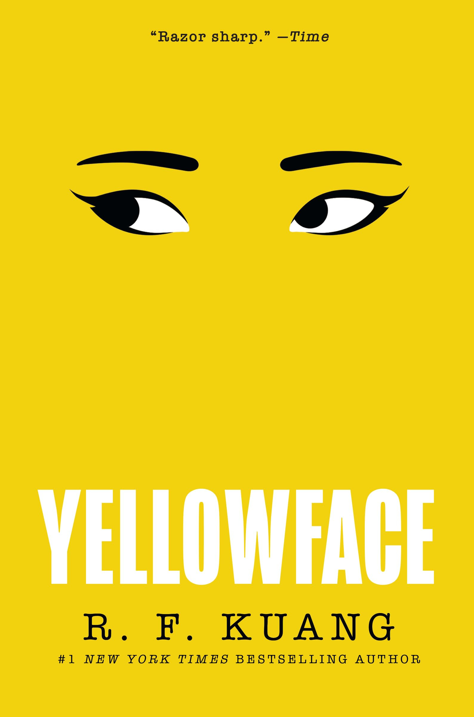
If I saw this book at a bookstore (I was gifted this copy), I’d pick it up. If I didn’t already know about the book, I’d probably read the flap. This is what covers are supposed to achieve, right?
But how often do I get to visit bookstores anymore? Not much. I have two small kids who require a lot of attention. A full-time job. A writing habit to keep up with.
The last time I visited my local independent bookstore, Books & Books, I was there with my kids. My wife and I realized the song my son had been singing to himself in the car were the words to the children’s book, Pete the Cat: I Love My White Shoes. That weekend, we put everyone in the car and made a big deal about taking him to the bookstore to buy the book. In the midst of pushing around the double stroller, explaining to my son why we couldn’t buy toys, and trying to stop my 10-month old from knocking down displays, I was able to steal a few minutes away to go to the fiction section.
I can’t even remember what I saw there, to be quite honest. But I know that the purchase I ended up making that day had nothing to do with the cover of the novel. I didn’t find it on a display table. My eyes weren’t drawn to a particular cover. No, I went directly to Julio Cortázar’s section on the wall.
I’d been thinking a lot about his novel, Hopscotch, which I devoured while traveling in Spain during the summer of 2018. Not only did I love the inventiveness of the novel, and the gritty writing, I also had been thinking a lot about the cover. It was striking to me when I first saw it and was always something I hoped to base the cover of my own book on one day.
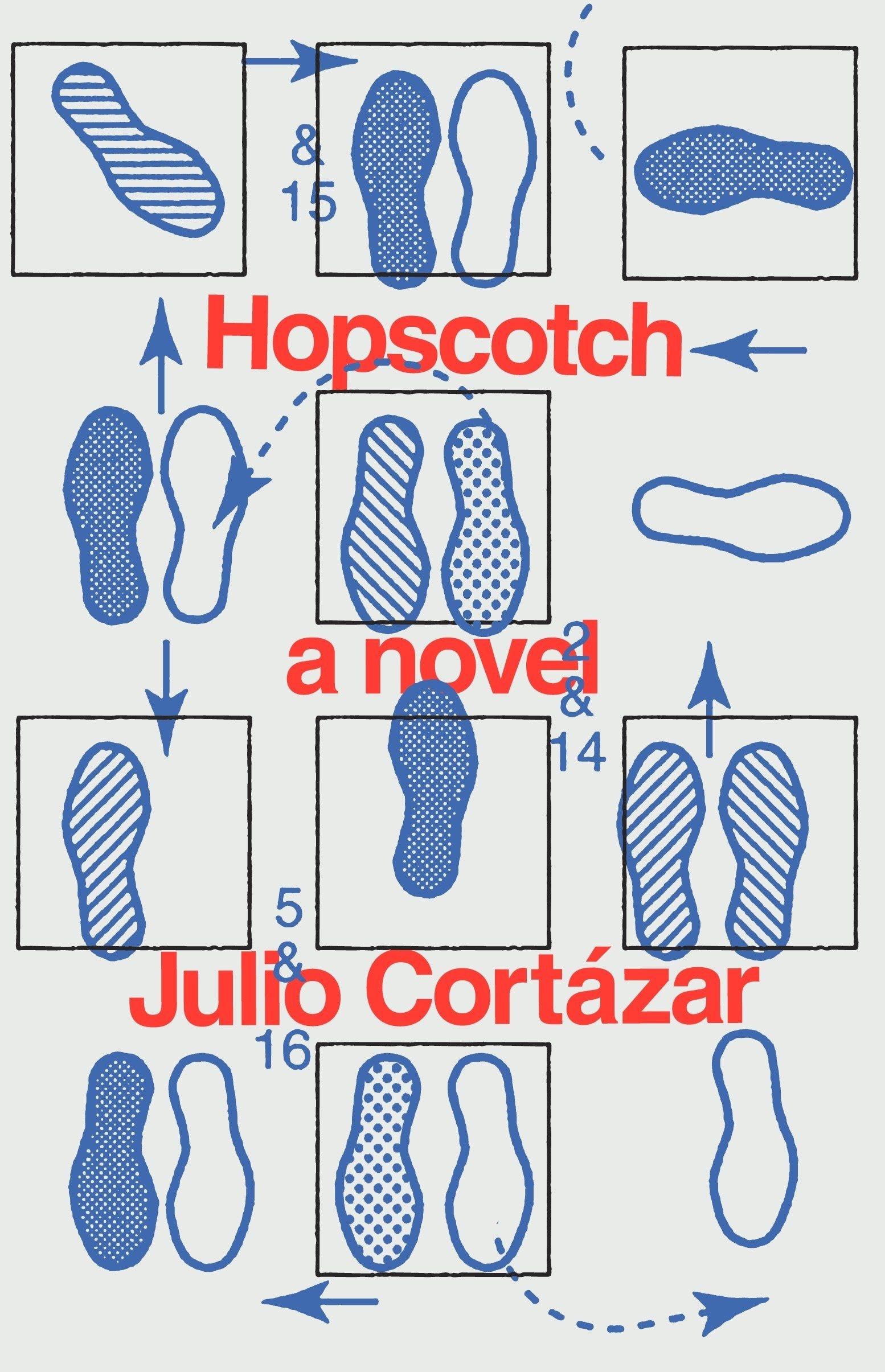
I loved the minimalist style and simple, yet bold, color palette. I loved how the illustration of feet moving in different, confusing directions, playing a haphazard version of the children’s game hopscotch, sought to convey the disoriented experience of reading the novel.
It seemed to be pure fate, when, earlier this Spring my editor and I were batting around previously published novel covers to look at for inspiration for the cover of Victim and she ended up sending me the Hopscotch cover.
But before I get to my own cover, back to my story about the bookstore. It is because of my history with Cortázar that I went right to his section. He’d been on my mind. That is why I ended up purchasing his novel, Cronopios and Famas. The cover of the book, while not ugly, didn’t exactly call my name. Rather, it was another, seemingly inventive novel by Cortázar that I hadn’t yet read. That was enough for me to purchase it—despite whatever may have been on the cover.
I’ve been thinking a lot about this experience since the release of my own cover a couple of weeks ago. I’ve been dwelling on this question: How important are books covers in 2023?
Ten years ago, around the time Kindles were becoming less-expensive, and more widely used, the essayist and cartoonist Tim Kreider speculated in the New Yorker that electronic reading devices, the proliferation of e-books, and big online retailers like Amazon would kill the significance of book covers.
“With the imminence of Kindles and e-readers, this is all moot anyway; soon enough, book covers, like album covers before them—like albums themselves, or sheet music for popular songs, or dance cards—will be a quaint, old-timey thing you have to explain to the uninterested young, and there’ll be one fewer excuse to strike up conversations with pretty strangers on the subway,” he wrote.
I don’t agree with his prediction, and I can’t say it has really borne out. I do agree, however, with his point that covers probably mean a bit less than they used to before these devices and platforms—to which I’d add social media, where I often hear about new books—came into existence. “The truth is, I don’t really need book covers to wow and sucker me in me anymore, because I mostly read books that friends or fellow writers or other books have recommended,” Kreider wrote. I’d agree with that.
Still, I do find there to be a lot of value in book covers. I like how Peter Mendulsund’s and David J. Alworth describe this value in a 2020 Literary Hub essay. “As a designed object, the book cover is a first look at the text and a visual rendering of what the text says: it is both an interpretation and a translation from verbal into visual signifiers.”
I am very pleased with the cover for my novel, not just because I think the illustration looks cool—I do—but also because I love that it subtly conveys some of what you will find inside the book.
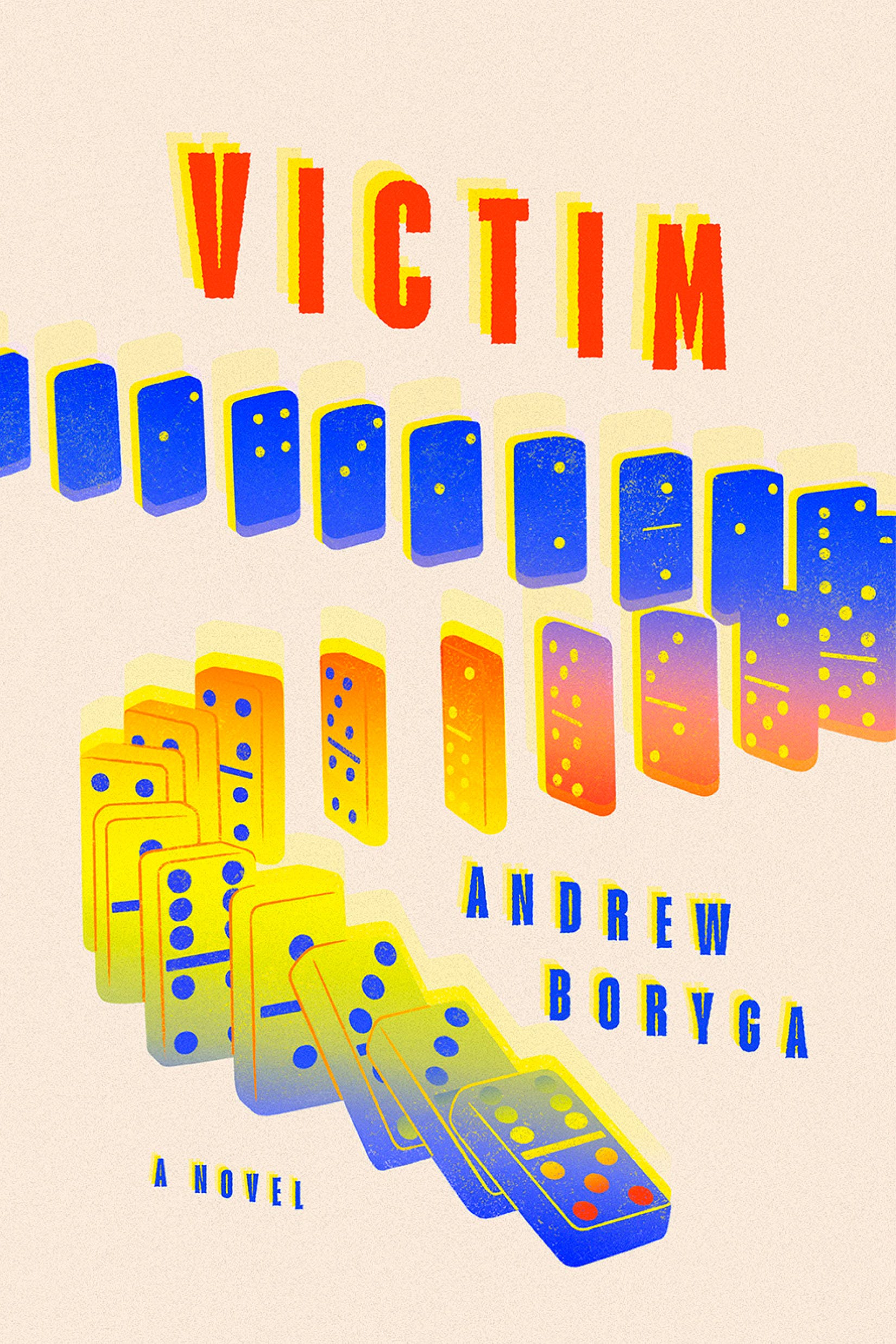
The dominoes designed by illustrator Victoria Sieczka, in particular, are perfect.
They hint at the book’s plot—Javi, my protagonist, makes a series of choices, finding success along the way, but in the end he makes one big choice that puts the structure that he’s built into jeopardy. But the dominoes also tie into Javi’s Puerto Rican background. Dominoes are a favorite family pastime among Puerto Ricans, and, usually, an opportunity to talk lots of shit and bond in the ways that Javi’s bonds with his loved ones proves important.
In the color scheme of the cover, you can see some of Cortázar’s influence. But I also appreciate that it hints at some playfulness, too. I believe that is important, and also ties into the style of writing in the novel, which has lots of humor packed into it.
Although I’ve read and heard horror stories about other writers and their cover process, I feel grateful to say that mine was pretty painless and enjoyable. Emily Mahon art directed the hell out of it, and tied all the elements together in a way that I’m so pleased with. It’s the sort of book that I believe can stand out in a store, on a table.
Which brings me back to the original question that made me write this post. How much does that matter anymore?
While I agree that covers probably matter less than they did before the proliferation of cell phones, social media, and the internet, I don’t think their value is completely “moot” as Kreider suggests.
I believe that covers, even those that you first see displayed to you on a computer screen or a cell phone screen, rather than a bookstore, still help create a first impression. They still help guide a reader toward choices when they encounter a sea of titles—whether that is in the physical or digital world.
Even if a book is recommended to you by a list or a Twitter account, a cover will still help readers feel compelled to come a bit closer, read the back flap, maybe even the first couple of pages.
In the past few months, that sort of experience led me to reading, and enjoying, Aesthetica by Alice Rowbottom and The Nursery by Szilvia Molnar. Two novels that I first learned about online, but that I decided to read because the covers also seemed interesting, and, upon further inspection, the book descriptions.
It is because of this experience that I still find covers to be useful. They still serve as an invitation to the reader to open the door, and take a peek inside for themselves. Which, these days, is all we can really ask for as writers.
I’d love to hear about your own thoughts about book covers these days. Are they still important? How much do they influence your purchases online or in-person? Do you have favorite covers? What is it about them that strikes you?
I’m genuinely curious to know the answers.
Peace,
Andrew
RECOMMENDATIONS:
This Washington Post piece by Gary Fisketjon, Cormac McCarthy’s old editor, has great insight into what the relationship between an editor and writer should look like. “Editing’s just a more relentless and specific form of reading in which you read a book more closely than any sane person would ever think of doing. And an editor’s responsibility to the author is to note page by page everything that crosses one’s mind, pro or con, large or small, that might prove useful.”
A very interesting study was released that challenges the prevailing notion that the world is getting worse, this New York Times piece by the authors of the study summarize some of it’s findings. I love stuff like this, because I’m also of the mind that the world is getting better, and genuinely perplexed why many of us want to fervently claim the opposite, even though our lifestyles and excess is a clear counterpoint. “Thanks to biased exposure, things look bad every day. But thanks to biased memory, when you think back to yesterday, you don’t remember things being so bad. When you’re standing in a wasteland but remember a wonderland, the only reasonable conclusion is that things have gotten worse.”
Alexandra Alter of the New York Times wrote a lovely piece on Robert Plunket, an out of print novelist who recently had his debut novel from the ‘80s picked up and republished by New Directions. “I’ve spent my life trying to sell myself, being clever and all that kind of stuff,” Plunket said. “I stopped when I retired, and I didn’t miss it. And now all of the sudden I have to go back to doing this little tap dance to please people.”
- is one of the sharpest thinkers writing about Latinos and Latinidad these days. He has a Substack you should check out, and a podcast where he interviews Latino writers. But his review of Hector Tobar’s new book in the Atlantic is proof, to me, of why he’s such an important thinker in this space. He could have easily held the line and accepted Tobar’s framing of Latinos and Latino history “as the history of a people who have endured traumas because of the actions of the U.S.” This is a common sentiment repeated by many, particularly in academia. But Cadava, thankfully, pushes back and widens the scope of what it means to be Latino and how many of us conceive our lives here in the U.S. “But this framing wouldn’t appeal to Latinos who see the United States as the country where their dreams came true, where they’ve built careers, bought homes, provided for their families. Having written a book about Latino Republicans, I know they would object to Tobar’s characterizations of them as angry and duped by conservative rhetoric.”
Finally, I really enjoyed this interview between Bill Maher and actor Jon Hamm for Maher’s podcast, Club Random. In addition to being a great actor (I was a huge fan of Mad Men), Hamm comes off as a genuinely thoughtful, and well-read man with a refreshingly nuanced take on politics, society, and Hollywood.
I too still value an artful cover, even though I choose books for other reasons, too. Once in awhile there is an opportunity to simply browse, and good covers are candy then. Yours looks great. The falling dominoes begin to create a sense of interconnectedness and uh-oh: suspense before the first paragraph!
Your cover looks great! Though I typically choose books based on reviews or recommendations.
Insightful post.